Website Coding

Building My Portfolio Website

This project shows the jump from my first personal website to the version you are viewing now. The aim was to make a clean, professional-looking webpage from which people can learn about me (with it acting as a mini-CV).

Goal Make a website
Problem I have no clue how to code

Two Builds

What Changed Between Versions

First Personal Website

My first version was an experiment in getting something working. I used a boot-up screen, simple buttons, and hidden sections to learn the basics of HTML, CSS, and JavaScript. This took several weeks of failure (longer than it took to beat Malenia in Elden Ring) but eventually worked. However, it was rather a pain to use due to the prolonged waiting before the website would "load".

View first version
Current Portfolio

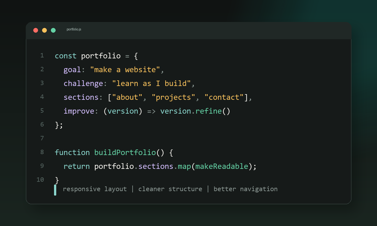
This version is more organised and easier to read. It uses clear sections, responsive layout, a project slider, stronger spacing, and contact links so the page works more like a real portfolio. It is also almost mobile-friendly.

View current version

Thought Process

How I Approached It

01

Start With The Purpose

I wanted the website to explain who I am, what I have done, and how someone could contact me without needing to search around.

02

Review other personal websites

I reviewed an extensive selection of personal websites ranging from the highly complex Daedal OS to simpler pages. From this I saw the common sections across these, curating my page to contain only the necessary parts.

03

Learn By Building

I built the first version while learning the basics, then used the problems I noticed to decide what the next version needed to improve.

Changes Made

Main Improvements

Structure

Moved from a single experimental layout to a full portfolio with About, Experience, Education, Projects, and Contact sections.

Design

Replaced the heavy terminal style with a cleaner layout, calmer colours, more consistent spacing, and cards that are easier to scan.

Interaction

Added a mobile navigation menu, project slider controls, and a contact form so the page feels more complete and practical.

Responsiveness

Adjusted the layout for smaller screens so the website is usable (not good to use) on both desktop and mobile.